PrintPlast is honored to announce our collaboration with Four Seasons Hotel Danieli, Venice, the storied palazzo on the Riva degli Schiavoni that has welcomed emperors, artists and travellers for almost seven centuries. For the hotel's relaunch as a Four Seasons property, we have produced a bespoke family of Four Seasons Venice key cards in three signature colors, each finished with raised gold foil and a delicate Venetian quatrefoil motif drawn from the architecture of the Palazzo Dandolo itself.
Set on the lagoon a few steps from St. Mark's Square, Hotel Danieli is one of the most recognisable addresses in Venice and one of the most anticipated openings in European luxury hospitality. The arrival of Four Seasons brings a new chapter to a building first opened to guests in 1822, and the guest key card was treated with the same care as every other detail of the restoration: a small object, held in the hand many times a day, that must feel unmistakably Venetian and unmistakably Four Seasons from the very first touch.
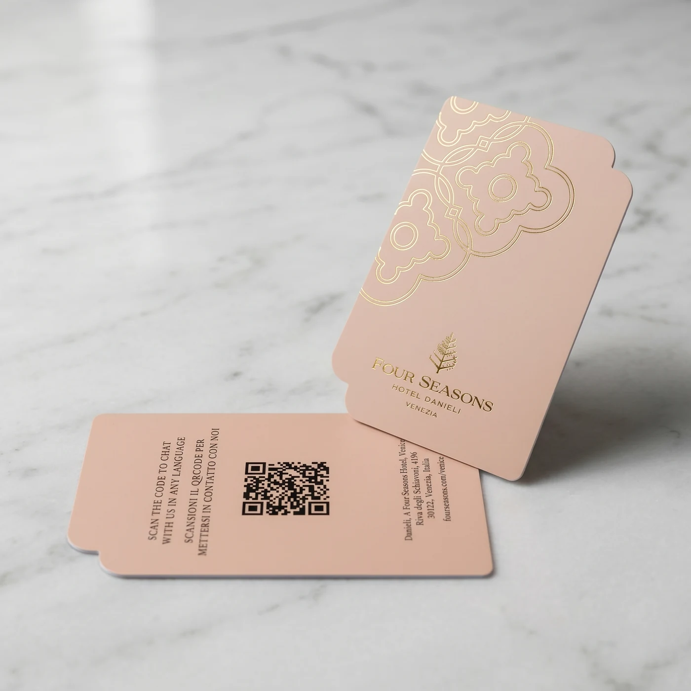
Blush colorway with raised gold foil Venetian quatrefoil and Four Seasons Hotel Danieli Venezia branding
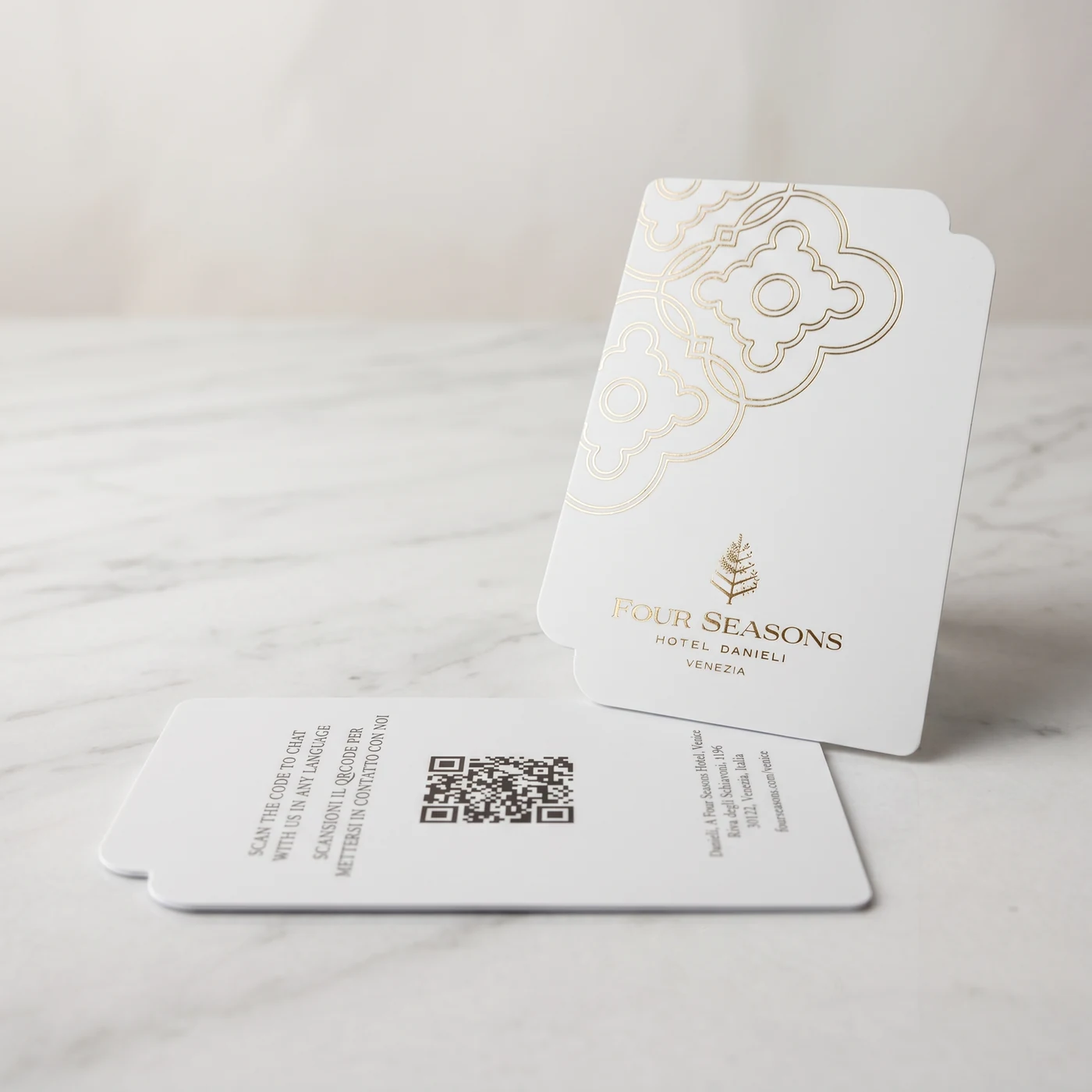
A Venetian Quatrefoil in Raised Gold Foil
The design language of the Four Seasons Hotel Danieli Venice key cards is rooted in the building itself. The signature element is a Venetian quatrefoil — the four-lobed Gothic motif found in the windows, balustrades and floor patterns of the historic palazzo — rendered as an oversized ornamental medallion in the upper corner of every card. Executed in raised gold foil, the motif catches light at slightly different angles as the card is held, a quiet reference to the play of sun and water on the Venetian lagoon.
At the foot of the card sits the Four Seasons tree mark and the wordmark "FOUR SEASONS HOTEL DANIELI VENEZIA", also in gold foil. The typography is restrained, the spacing generous, the hierarchy clear. There is no visual noise, no competing graphic, no printed image — only color, gold foil and the silhouette of the card itself, which carries a soft side notch that nods to the shape of a Venetian shutter or palace door.
What elevates the card from printed to crafted is the raised foil technique. Rather than a flat metallic print, the gold sits proudly above the surface of the card, with a tactile relief that fingertips immediately register. Run a thumb across the quatrefoil and the pattern reveals itself before the eye even returns to it. For a guest checking into one of the most romantic hotels in the world, this is the kind of small, deliberate detail that sets the tone for the entire stay.
Three Colorways for the Floors of Hotel Danieli
Rather than a single key card design, Four Seasons Hotel Danieli Venice has adopted a family of three colorways, each used to distinguish a different category of room or floor within the hotel. The palette has been chosen to harmonise with the interiors restored by Pierre-Yves Rochon, and to photograph beautifully against the polished marble surfaces of the palazzo.
- Sage olive — a muted Mediterranean green that recalls the cypress trees of the Veneto countryside and the patinated bronze of historic Venetian fittings.
- Blush nude — a warm, dusty pink drawn from the Istrian stone and Venetian plaster facades visible along the Riva degli Schiavoni at sunrise.
- Soft warm white — a near-cream tone that lets the raised gold foil dominate, ideal for the hotel's highest-tier suites.
Across all three colors, the gold foil treatment, the wordmark and the silhouette remain identical, which means the cards read as a single coordinated family even when guests see two or three of them on a marble console at the front desk.
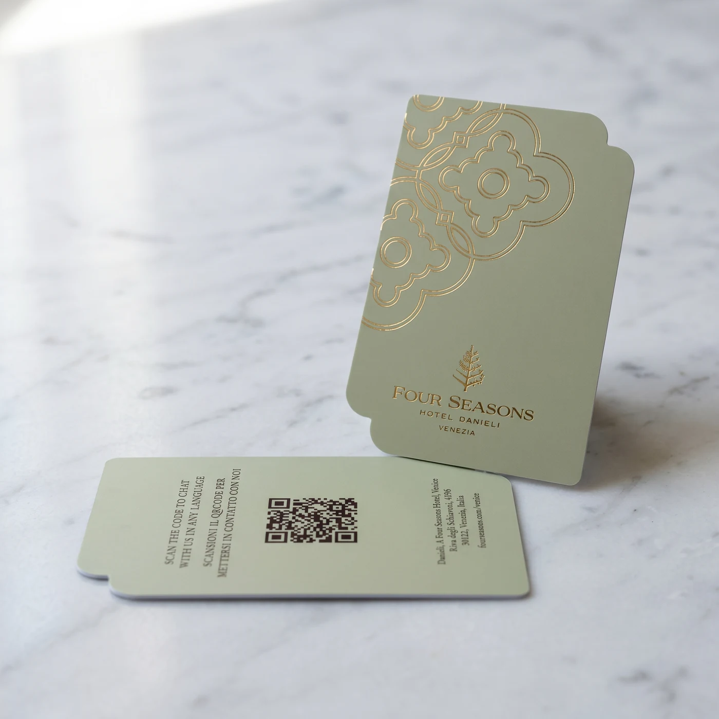
The sage colorway: a quiet, Mediterranean tone that lets the raised gold foil quatrefoil sing
Bilingual QR-Code Reverse for the International Guest
The reverse of the Four Seasons Venice key card has been engineered as carefully as the front. A centered QR code invites the guest to "SCAN THE CODE TO CHAT WITH US IN ANY LANGUAGE / SCANSIONI IL QRCODE PER METTERSI IN CONTATTO CON NOI", opening a multilingual chat channel with the hotel concierge. Beneath the QR code, the property address is rendered in vertical text — Danieli, A Four Seasons Hotel, Venice · Riva degli Schiavoni, 4196 · 30122, Venezia, Italia · fourseasons.com/venice — turning the card itself into a small, elegant business card the guest can pocket and use throughout the city.
This bilingual, QR-enabled reverse reflects a wider shift in luxury hospitality: every touchpoint, including the key card, is now expected to extend service rather than simply enable door access. The card is functional security, and it is also a silent, always-available concierge.
"Hotel Danieli is one of the most photographed addresses in Venice. The key card a guest is handed at check-in needs to live up to the building it opens. Raised gold foil on a Venetian quatrefoil, in three colors that match the palazzo's own palette, is our way of making sure it does."
Venice: A City Where Detail Has Always Mattered
Venice is a city built on craft. From the murano glass of its chandeliers to the gold leaf of its altarpieces, from the cobalt blue of its papier-mâché masks to the carved oars of its gondolas, every surface in Venice has been considered, refined and finished by hand. A hotel key card produced for Four Seasons Hotel Danieli, Venice, must enter that conversation rather than interrupt it.
The choice of raised gold foil over a flat printed metallic, the choice of a Venetian quatrefoil over a generic ornament, the choice of three matched colorways rather than a single neutral — each of these decisions was made to anchor the card in Venice specifically, not in a generic idea of European luxury. For an international guest arriving by water taxi from Marco Polo Airport, this is the first physical object handed across the front desk. It carries a meaningful portion of the property's first-impression weight.
The card also has a quiet practical role for the city. Hotel Danieli's restoration and reopening as a Four Seasons property is a significant moment for Venetian hospitality, and the launch is being watched closely across the industry. Properties from the Grand Canal to the Lido will be looking at the design choices made by Four Seasons here — including the choices made about something as ostensibly small as a guest key card.
PrintPlast's Approach to the Four Seasons Venice Key Card
Building the Four Seasons Venice key cards was, for our production team, a study in restraint. The brief from the property's design team was clear: nothing on the card should distract from the building itself. The quatrefoil needed to read as architectural, not decorative. The gold foil needed to feel like gilding, not like print. The three colorways needed to behave as a single family under the lobby light at any time of day.
To deliver against that brief we built custom foil dies for the quatrefoil and the wordmark, ran extended color trials on each substrate to lock the sage, blush and soft white against the approved Four Seasons palette, and tested the raised foil against repeated handling to confirm that the relief survives months of guest use without crushing or tarnishing. Each card was tested end-to-end on the property's RFID lock platform to confirm full compatibility across guest rooms, elevators and back-of-house doors before the first production run shipped to Venice.
Every Four Seasons key card that leaves our facility is inspected for foil registration, color match, embossing depth and RFID encoding. That level of quality control is what allows us to work with houses like Four Seasons, where a key card is never just a key card.
The soft warm white colorway, reserved for top-tier suites at Four Seasons Hotel Danieli Venice
Elevate Your Hotel's Key Card Experience
Discover how PrintPlast's custom RFID hotel key cards with raised gold foil, embossing and bespoke colorways can extend your property's brand into the guest's hand. Join Four Seasons Hotel Danieli, Venice, and the world's leading luxury houses in treating the key card as a first impression, not a commodity.
Contact: info@printplast.com
Solutions: RFID Hotel Key Cards · PPH BioBoard Cards · Wooden Key Cards
About Four Seasons Hotel Danieli, Venice
Four Seasons Hotel Danieli, Venice occupies the historic Palazzo Dandolo on the Riva degli Schiavoni, a short walk from St. Mark's Square and the Doge's Palace. First opened as a hotel in 1822, the property is one of the most storied addresses in Venice and reopens as a Four Seasons after a comprehensive restoration led by designer Pierre-Yves Rochon. The hotel offers lagoon-facing suites, a rooftop restaurant overlooking the Bacino di San Marco, and direct water-taxi access from Marco Polo Airport. For reservations and inquiries, visit fourseasons.com/venice.
We are proud to partner with Four Seasons Hotel Danieli, Venice on a key card program that honours both the city and the building it opens. As Venice writes its next chapter, PrintPlast remains committed to producing key cards that carry the same level of craft as the palazzos they belong to, one Venetian quatrefoil at a time.